Challenge
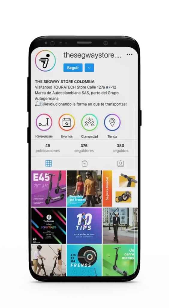
Many Segway-Ninebot stores on Instagram use similar visual styles, especially with the brand’s logo, making it challenging for The Segway Store to stand out as the primary distributor. During our graphic analysis, we also identified a cluttered, oversaturated feed that detracted from the aspirational look expected for a product in this category.
Solution
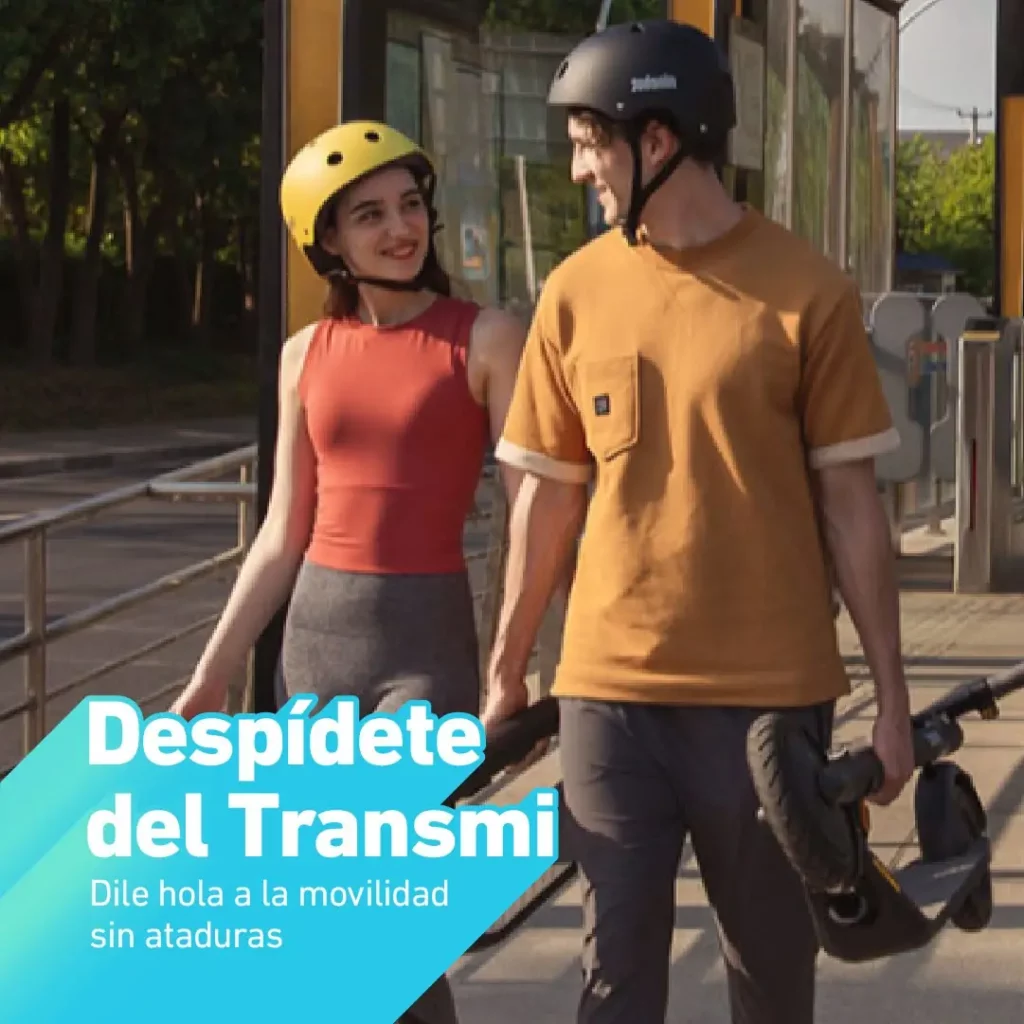
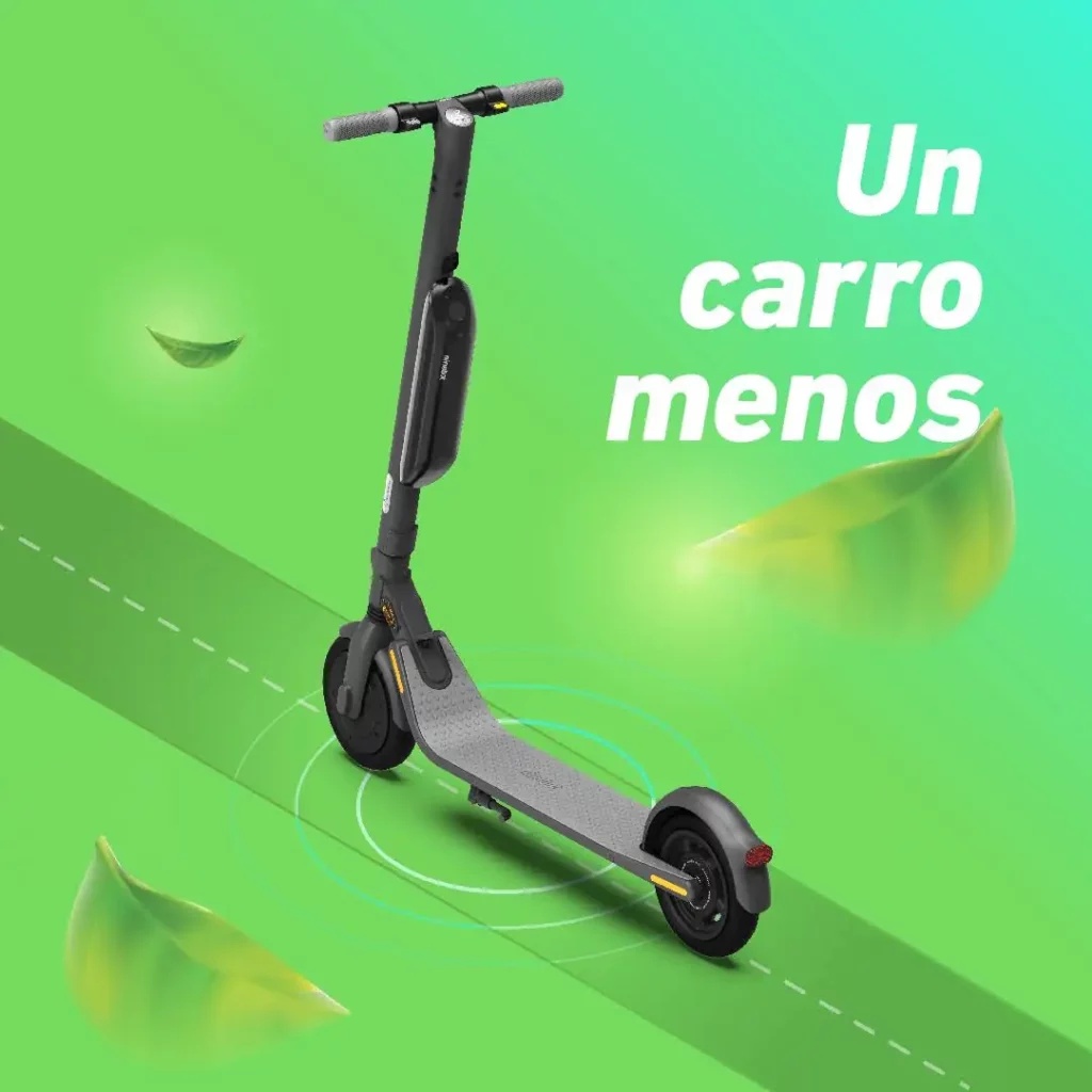
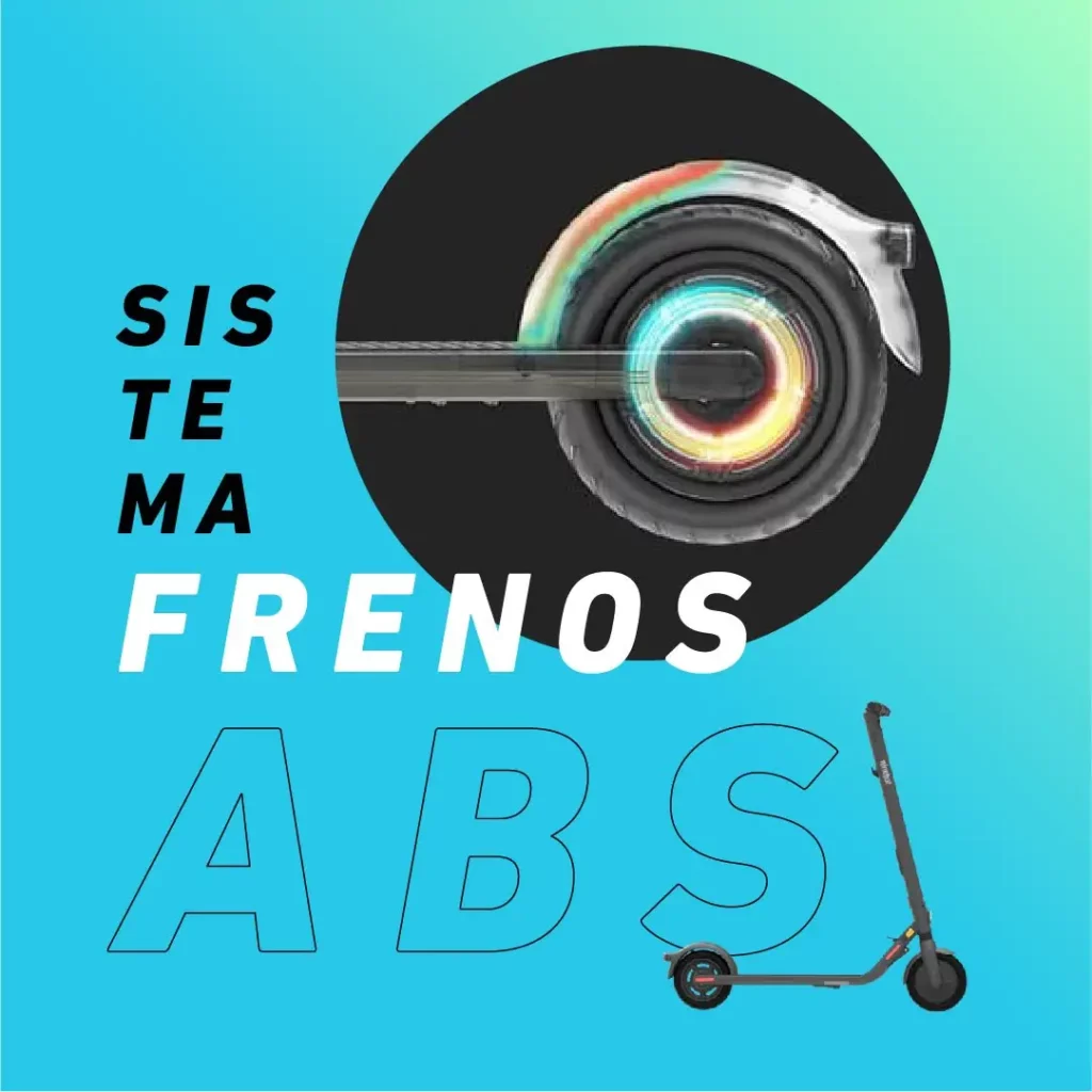
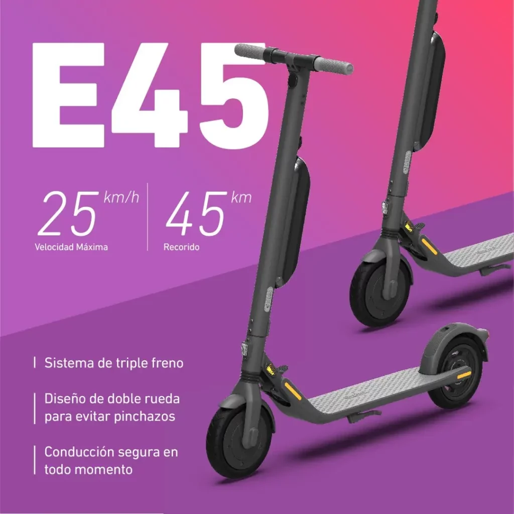
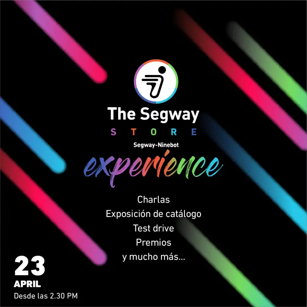
To differentiate from other brand distributors, we leveraged Segway’s packaging colors, which bring more visual impact than the typical black-and-white of Segway-Ninebot. This shift allowed us to create a fresher, more relatable look while maintaining the product’s aspirational appeal.
These colors help the product pop against the black background, adding more vibrancy to the overall brand image.
We also introduced structure and clarity by categorizing content into three main pillars: Lifestyle, Safety and Culture, and Product.
